Responsive Web Design
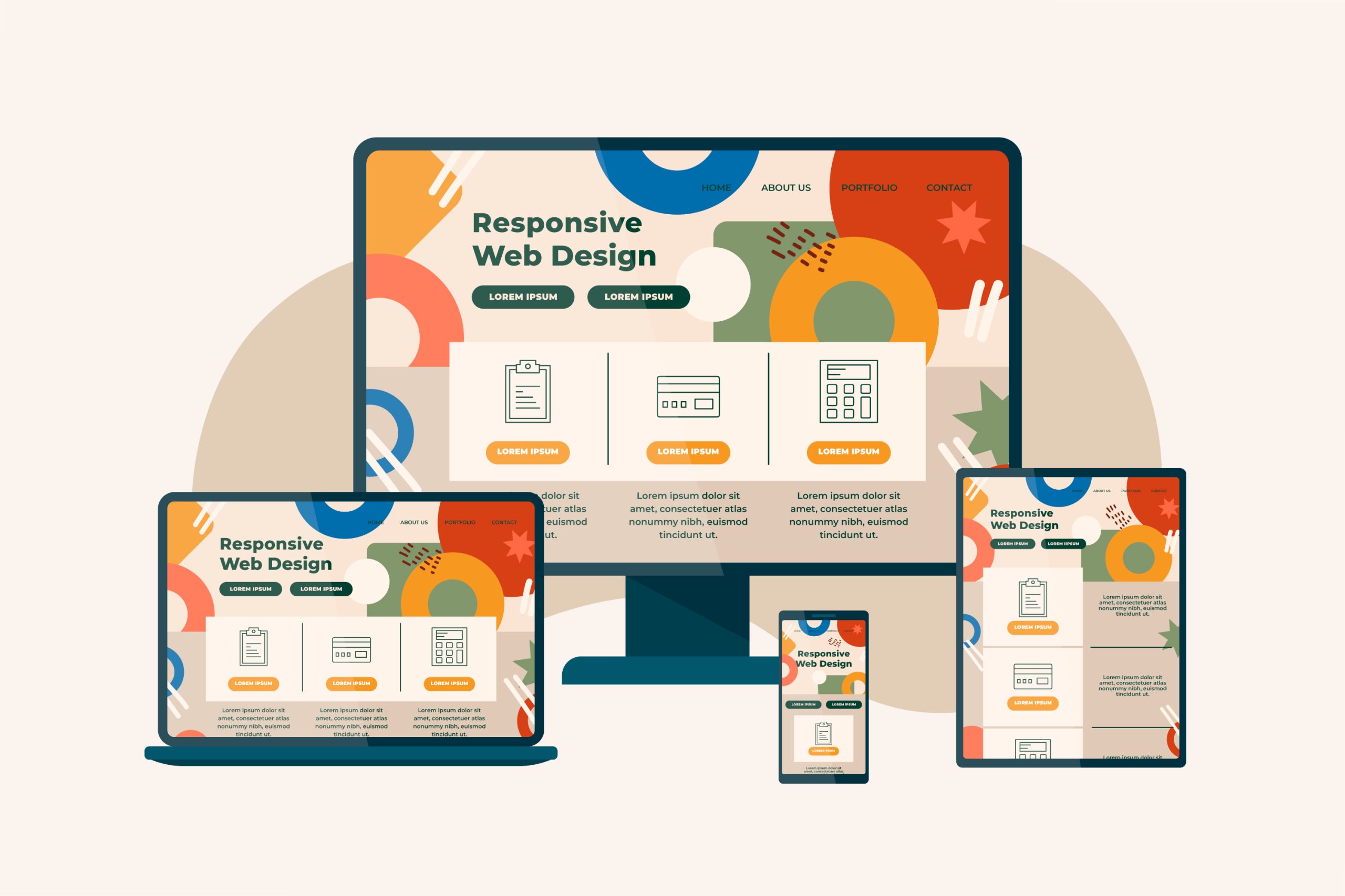
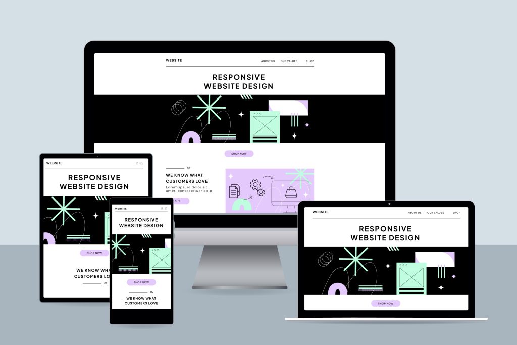
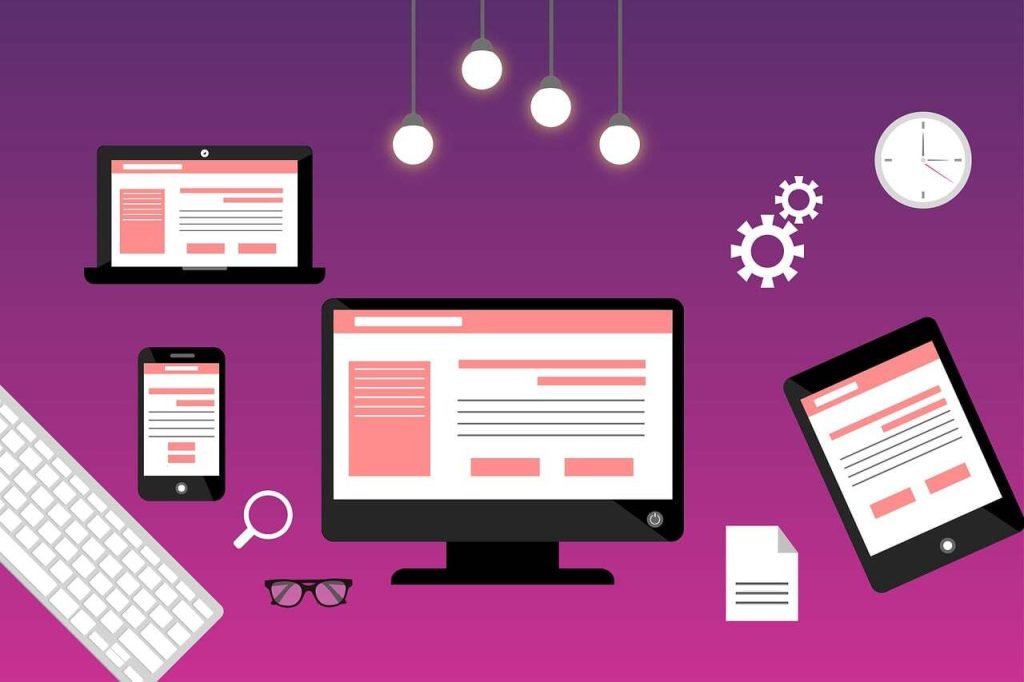
In today’s digital world, your customers are browsing the internet from a variety of devices, including smartphones, tablets, laptops, and desktop computers. A responsive website ensures that your business delivers a seamless and engaging user experience across every screen size and device.
At Carson Telecom, we create modern, responsive websites that automatically adapt to different screen resolutions and browsing environments. Whether your visitors access your website from a mobile phone while on the go or from a desktop computer at the office, your website will look professional, load quickly, and function flawlessly.
Why Responsive Web Design Matters
More than half of all web traffic now comes from mobile devices. If your website is difficult to navigate on smaller screens, visitors are likely to leave and choose a competitor instead. A responsive website helps you provide an optimal experience for every user while improving your online visibility and business credibility.
Responsive design also plays an important role in search engine rankings. Search engines prioritize mobile-friendly websites, making responsiveness an essential part of your overall digital marketing strategy.

Our Responsive Web Design Features
- Mobile-friendly layouts that automatically adjust to all screen sizes
- Clean, modern, and visually appealing designs
- Fast-loading pages for improved user experience
- Easy-to-use navigation across all devices
- Optimized images and content for better performance
- Search engine-friendly structure and coding practices
- Cross-browser compatibility for consistent performance
- Secure and scalable website architecture
- Integration with contact forms, maps, social media, and third-party tools
- Content management systems that allow easy updates and maintenance
Benefits of a Responsive Website
Enhanced User Experience
Provide visitors with a smooth, intuitive browsing experience regardless of the device they use.
Improved Search Engine Visibility
Mobile-friendly websites perform better in search engine results, helping potential customers find your business online.
Increased Engagement and Conversions
A responsive design encourages visitors to stay longer, explore your services, and take action.
Cost-Effective Solution
Maintain a single website that works across all devices instead of managing separate desktop and mobile versions.
Future-Ready Technology
Responsive websites are built to adapt to new devices and screen sizes as technology evolves.
Our Design Process
We begin by understanding your business goals, target audience, and industry requirements. Our team then creates a customized website strategy focused on user experience, functionality, and performance.
From planning and design to development, testing, and launch, we ensure your website is responsive, secure, and optimized for long-term success.
Customized Solutions for Every Business
Every business has unique goals and requirements. Whether you need a simple informational website, a service-based business website, a portfolio site, or a feature-rich platform, we tailor each project to meet your specific needs.
We do not offer one-size-fits-all packages. Our pricing is based on your business objectives, desired features, content requirements, and overall project scope.
Contact us today to discuss your project requirements and receive a customized quote for your responsive website design needs.